Relayer / Reference library
Design System
A near-black foundation, vivid red accents and fine grid borders. DM Sans headings feel precise and approachable; Inter carries compact supporting copy. Square surfaces, restrained motion and glowing magic-wand illustrations give the AI-agent product a technical, editorial character.
Desktop reference only • Design canvas • Not a website route
01 / Colors
Use the named style by semantic role; translucent swatches are composited on BG Light.
Backgrounds
BG
#030303
Page canvas
Surfaces
White 5%
#FFFFFF0D
Layered content and overlays
BG Light
#0A0A0A
Layered content and overlays
Bg Lighter
#171717
Layered content and overlays
Text
White
#FFFFFF
Primary and supporting foregrounds
Light Grey
#DBDBDB
Primary and supporting foregrounds
White
#FFFFFF
Primary and supporting foregrounds
Muted text
Text Grey
#999999
Secondary copy and neutral details
Grey
#454545
Secondary copy and neutral details
Accents
Primary
#FF3640
Interactive emphasis and accent wash
Faded Primary
#FF40531A
Interactive emphasis and accent wash
Borders
Lines
#2B2B2B
Section dividers and grid strokes
Status
Error BG
#F6543E33
Error and success feedback
Red
#F6543E
Error and success feedback
Success
#A5F53D33
Error and success feedback
White exists twice as separate styles. Preserve references; identical names are not permission to merge.
Contrast / WCAG AA
White on BG · 20.62:1 · Body PASS · Large PASS
Text Grey on BG · 7.24:1 · Body PASS · Large PASS
Primary on BG · 5.75:1 · Body PASS · Large PASS
White on Primary · 3.59:1 · Body FAIL · Large PASS
AA body ≥ 4.5:1; large ≥ 3:1. White on Primary fails normal-size body text; preserve the finding rather than silently changing shared styles.
02 / Typography
Every specimen is attached to its original Text Style; labels use Body M or Body S.
Heading 1
DM Sans · 64px · weight 500 · line 100% · tracking -0.04em
Used in: Title, Title, Title, Title.
Heading 2
DM Sans · 40px · weight 500 · line 120% · tracking -0.03em
Used in: Title, Title, Title, Title.
Heading 3
DM Sans · 35px · weight 500 · line 110% · tracking -0.01em
Used in: Heading, Heading, Title, Heading.
Heading 4
DM Sans · 25px · weight 500 · line 150% · tracking 0em
Used in: Heading H3, Heading, Heading H3, Heading.
Heading 5
DM Sans · 22px · weight 500 · line 150% · tracking -0.02em
Used in: Heading H4, Title, Heading H4.
Caption Text
Inter · 10px · weight 500 · line 100% · tracking 0.17em
Used in: Subtitle.
Body M
Inter · 16px · weight 500 · line 150% · tracking -0.03em
Used in: Title, Subtitle, Title, Subtitle.
Body L
Inter · 18px · weight 500 · line 150% · tracking -0.03em
Used in: Subtitle, Title, Title, Text.
Body S
Inter · 14px · weight 500 · line 150% · tracking -0.03em
Used in: Title, Subtitle, Subtitle, Subtitle.
Body XS
Inter · 12px · weight 500 · line 150% · tracking -0.03em
Used in: no existing direct layer usage found before this specimen.
Body XXS
Inter · 10px · weight 500 · line 150% · tracking -0.03em
Used in: no existing direct layer usage found before this specimen.
Heading 1
Heading 2
Heading 3
Heading 4
Heading 5
Body L
Body M
Body S
Caption Text
Link Styles / live default and hover
Nav Links
Default: Text Grey. Hover: White with Primary dashed underline. Current-page styling remains part of the shared link style; hover the specimen in preview.
Footer Links
Default: Text Grey. Hover: Primary. Current-page styling remains part of the shared link style; hover the specimen in preview.
03 / Spacing & shape
Measured values come from the current Sections and Cards variants, not a newly invented scale.
CTA Section
Desktop: padding 0px · gap 0px · radius not set / square descendants where defined
Tablet: padding 0px · gap 0px · radius not set / square descendants where defined
Phone: padding 0px 20px 0px 20px · gap 0px · radius not set / square descendants where defined
Pricing Section
Monthly: padding 0px · gap 40px · radius not set / square descendants where defined
Yearly: padding 0px · gap 40px · radius not set / square descendants where defined
Mobile - Monthly: padding 0px · gap 40px · radius not set / square descendants where defined
Mobile - Yearly: padding 0px · gap 40px · radius not set / square descendants where defined
FAQ
Primary: padding 0px · gap 0px · radius not set / square descendants where defined
1: padding 0px · gap 0px · radius not set / square descendants where defined
2: padding 0px · gap 0px · radius not set / square descendants where defined
3: padding 0px · gap 0px · radius not set / square descendants where defined
4: padding 0px · gap 0px · radius not set / square descendants where defined
5: padding 0px · gap 0px · radius not set / square descendants where defined
6: padding 0px · gap 0px · radius not set / square descendants where defined
Plan Card
Primary: padding 30px · gap 32px · radius not set / square descendants where defined
Popular: padding 30px · gap 32px · radius not set / square descendants where defined
Feature Card
RightLeft: padding 24px · gap 34px · radius not set / square descendants where defined
Phone: padding 0px · gap 34px · radius not set / square descendants where defined
Left Right: padding 24px · gap 34px · radius not set / square descendants where defined
FAQ Question
FAQ Question Closed: padding 33px 20px 33px 20px · gap 15px · radius not set / square descendants where defined
FAQ Question Open: padding 33px 20px 33px 20px · gap 15px · radius not set / square descendants where defined
Testimonial Slider
Primary: padding 0px · gap 1px · radius not set / square descendants where defined
Form
Primary: padding 0px · gap 30px · radius not set / square descendants where defined
Phone: padding 0px · gap 30px · radius not set / square descendants where defined
8px
Existing gap / padding unit
16px
Existing gap / padding unit
24px
Existing gap / padding unit
40px
Existing gap / padding unit
Guide: 100px vertical / 40px horizontal padding; 1200px canvas. Main site content max-width 1200px; prose commonly 700px. Home section-heading strips often use 60px vertical. Plan Card uses 30px padding / 32px gap; Feature Card 24px / 34px.
0px radius
5px radius
8px radius
50px radius
04 / Buttons
Instances show saved variants. Hover states remain live; disabled exists only on Form Button.
Primary Button
Primary
Primary action / Secondary alternative. Hover to inspect saved gesture.
Secondary
Primary action / Secondary alternative. Hover to inspect saved gesture.
Saved hover variants: Primary / hover, Secondary / hover. Other unavailable states are not fabricated.
Form Button
Default
Form submission feedback state.
Loading
Form submission feedback state.
Disabled
Form submission feedback state.
Success
Form submission feedback state.
Error
Form submission feedback state.
Saved hover variants: Default / hover. Other unavailable states are not fabricated.
Feature Toggle
OFF

Feature inclusion indicator.
ON

Feature inclusion indicator.
Saved hover variants: none. Other unavailable states are not fabricated.
Year/Month Switcher
Month
Monthly
Yearly
Billing cadence selector.
Year
Monthly
Yearly
Billing cadence selector.
Saved hover variants: none. Other unavailable states are not fabricated.
05 / Badges
Eyebrow provides compact section context, with or without an icon.
Eyebrow text
Without Icon
Eyebrow text
With Icon
06 / Cards
Filled live examples retain original component structure and exposed controls.
FAQ Question
What is Relayer?
Properties: Variant · Question · Answer · Click · Border Visible · Border
Testimonial Slider
"Relayer turned our messy lead process into a fully autonomous system. Our sales team now closes deals faster while the agents handle qualification and follow-ups."
Sarah Chen
Head of Sales, NovaFlow
Properties: Variant · Review · Client Name · Company/Role
Plan Card
Starter
Perfect for individuals and small tests.
$19
/ month
Features Included
3 Active agents
500 automation steps per month
Basic integrations
Community support
Human-in-the-loop controls
Properties: Variant · Title · Description · Price · Duration · Button Text · Link · Feature 1 · Feature 2 · Feature 3 · Feature 4 · Feature 5
Feature Card
Properties: Variant · Image · Tagline · Title · Description · Button Title · Link · Dither Enabled
Form
Reference only. Existing contact destination is not configured; no submission connection was changed.
Properties: Variant
07 / Navigation
Shared navigation and footer remain actual instances; the phone drawer is shown open.
08 / Brand
Logo variants come from Brand; favicon and OG assets are read from current site metadata.

Primary · 104px × 27px
Bigger · 115px × 30px
Smaller · 86px × 22px
Formal clear-space and minimum-size guidelines: NOT FOUND. Smallest existing Logo variant is 86 × 22px; this is observed sizing, not an approved minimum. No separate wordmark, favicon or OG component exists in Brand.

Favicon / light

Favicon / dark
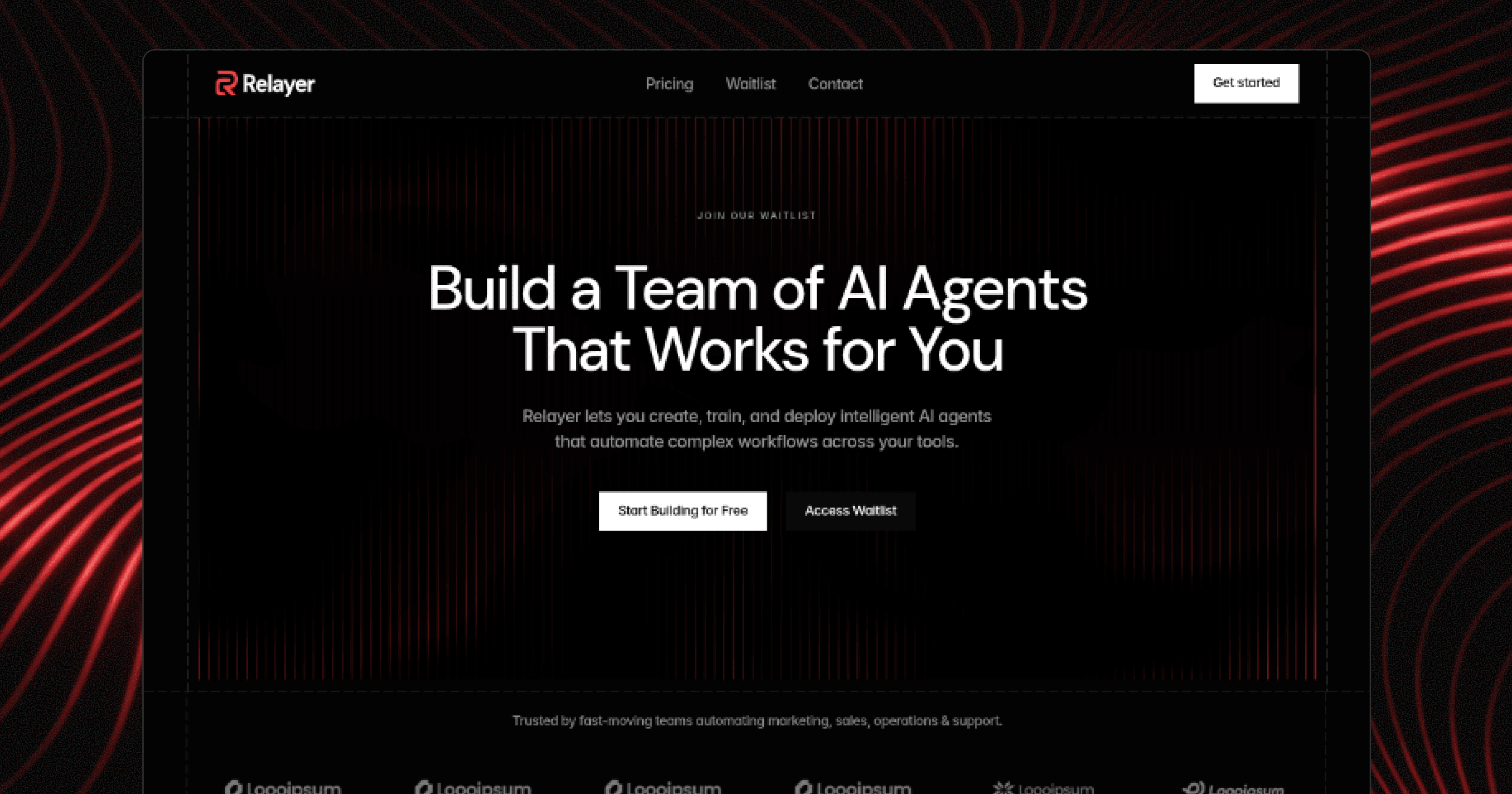
Social / OG image
09 / Sections
Three reusable building blocks exist in Sections. These are live desktop instances.
CTA Section
Final conversion prompt


Pricing Section
Plan comparison and billing cadence
FAQ
Common questions and expandable answers
What kind of tasks can Relay agents handle?
Do I need coding skills to create agents?
How does the Human-in-the-Loop system work?
Which tools and apps does Relay integrate with?
Is my data secure?
10 / Illustrations & icons
Keep illustration colors in their original assets; recolor editable icons through shared color styles.

Magic wand over glowing sales dashboard.png / raster artwork; not an editable vector.
Activity
Check
Menu
X
Feather samples above are real icons. Other external sets present: Material, Meteor, Iconic, Phosphor, Basicons. Local Vectors assets: none found. Never flatten/recolor a raster as if it were a vector; bind editable foregrounds to existing styles.
11 / Breakpoints
This reference page stays desktop-only; the table documents the live site’s existing responsive system.
Desktop · 1440px canvas · viewport ≥ 1440px
Tablet · 810px canvas · viewport 810–1439.98px
Phone · 390px canvas · viewport < 810px
Navbar: Desktop → Tablet → Phone / Phone - Open drawer.
Feature Card: RightLeft or Left Right → Phone stacked composition.
Pricing Section: Monthly/Yearly → Mobile - Monthly/Mobile - Yearly.
CTA Section: Desktop → Tablet → Phone; phone adds 20px horizontal padding.
Footer and Form: Desktop/Primary → Phone. Inspect their variants before overriding or hiding anything.
Text-style Heading 1–3 desktop boundary is 1200px, distinct from page Desktop at 1440px.
12 / Rules & audit
Preserve the shared system and document exceptions rather than silently changing live assets.
Do bind to Color and Text Styles / Don’t type raw brand values.
Do reuse component instances / Don’t redraw their contents.
Do use Main for shared chrome / Don’t duplicate navigation on routed pages.
Do inspect saved variants / Don’t invent unavailable states.
Do preserve form connections and published slugs / Don’t change them during visual reference work.
Styles without a confirmed pre-existing direct or component-control reference: Faded Primary, Red, Body XS, Body XXS. Catalog specimens on this page now use them; opaque external internals are outside this scan.
All newly authored labels and swatches use shared styles. Existing component instances can inherit inline font sizes or raw status colors from their source definitions; those exceptions are preserved and reported, not rewritten.
Your Questions
Frequently Asked Questions
Everything you need to know about building and running AI agents with Relay.
What kind of tasks can Relay agents handle?
Do I need coding skills to create agents?
How does the Human-in-the-Loop system work?
Which tools and apps does Relay integrate with?
Is my data secure?